Doctor Sleep & The Shining / Warner Bros.
Immersive Web Experience
To promote the home video release of Doctor Sleep and a newly restored 4K release of The Shining, Warner Bros. looked to our team to craft a new immersive experience for the Experience WB site our team had previously built.
From the start, the vision was to follow lead character Danny Torrance's (Ewan McGregor) return to the forbidding Overlook Hotel—first mirroring his journey, and then allowing audiences to enter and explore the hotel themselves.
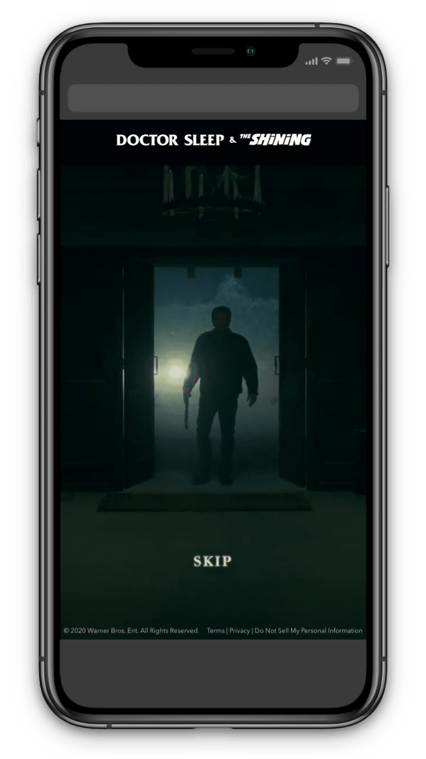
Enter the Overlook
We began the experience by dropping some augmented reality snow in the user's real-world space before transitioning them to an establishing shot of the Overlook's entrance and an intro video of Ewan McGregor's character as he returns to "wake" the dormant hotel. He flicks the lights back on, and so did we, dropping users into the hotel's infamous halls.
"For people who grew up loving The Shining, the Overlook exists in our imagination almost in its completion.”
- Doctor Sleep director Mike Flanagan
Crafting the Environment
Using stills from the films as reference, our 3D artists modeled a long section of the hotel's hallways, including period ashtrays, armchair, and a bank of the red-doored elevators made notorious in the nightmarish "river of blood" scene.
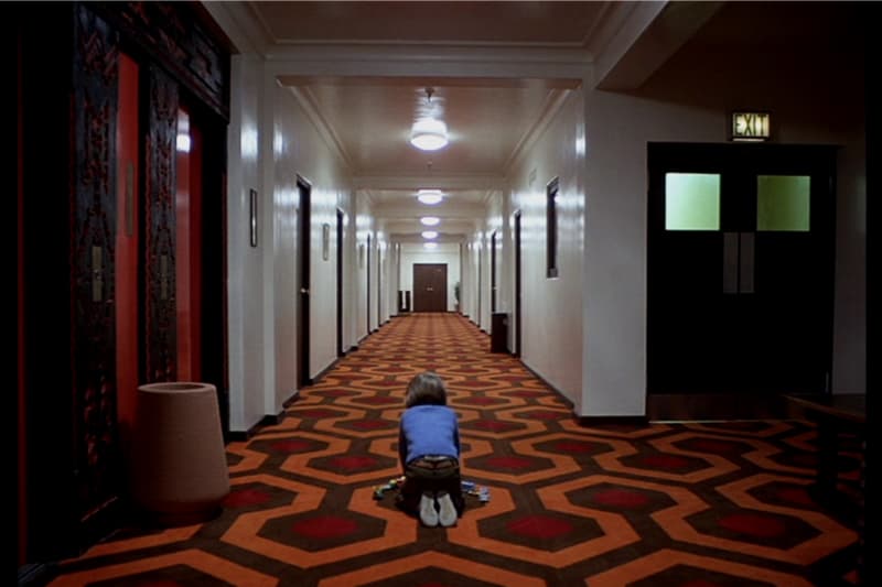
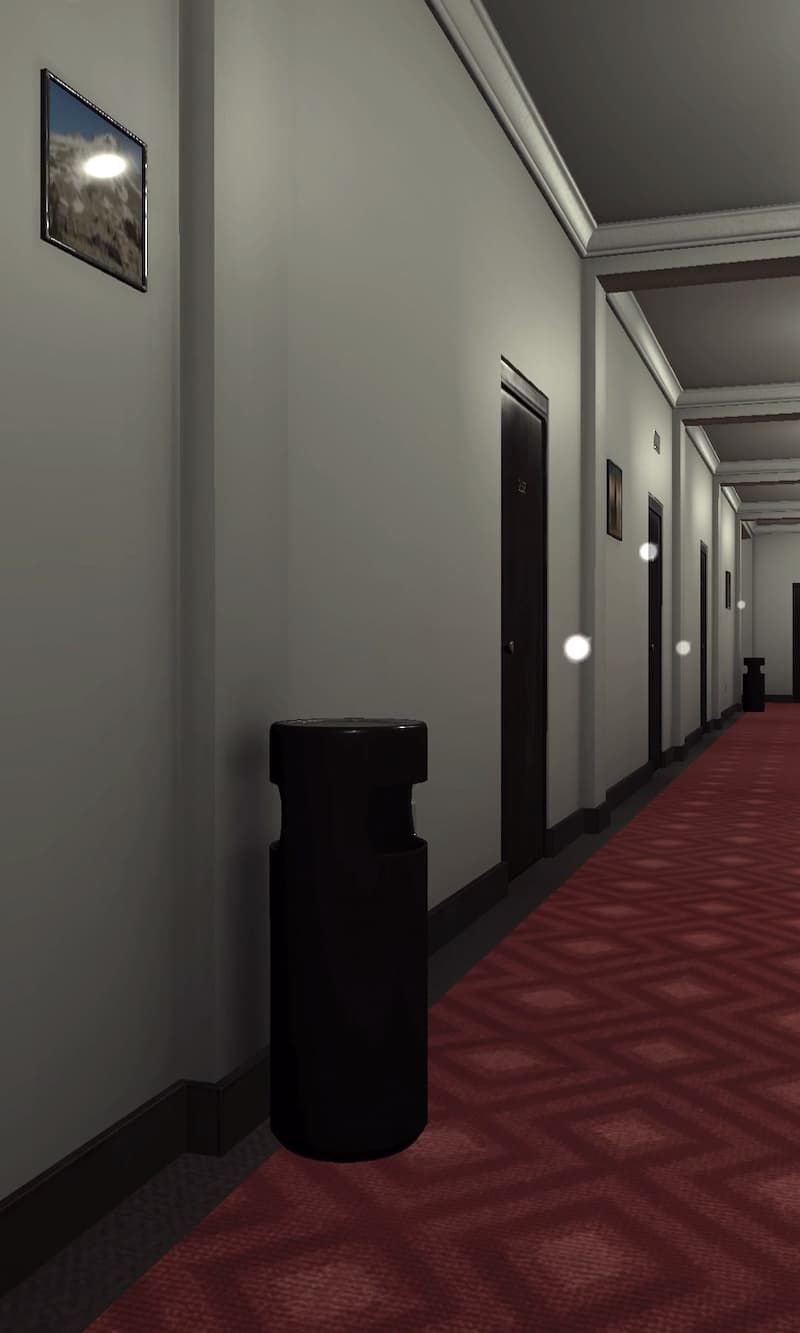
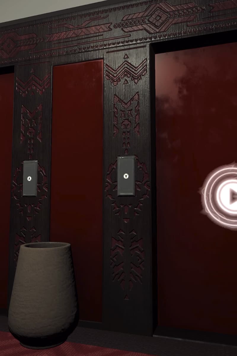
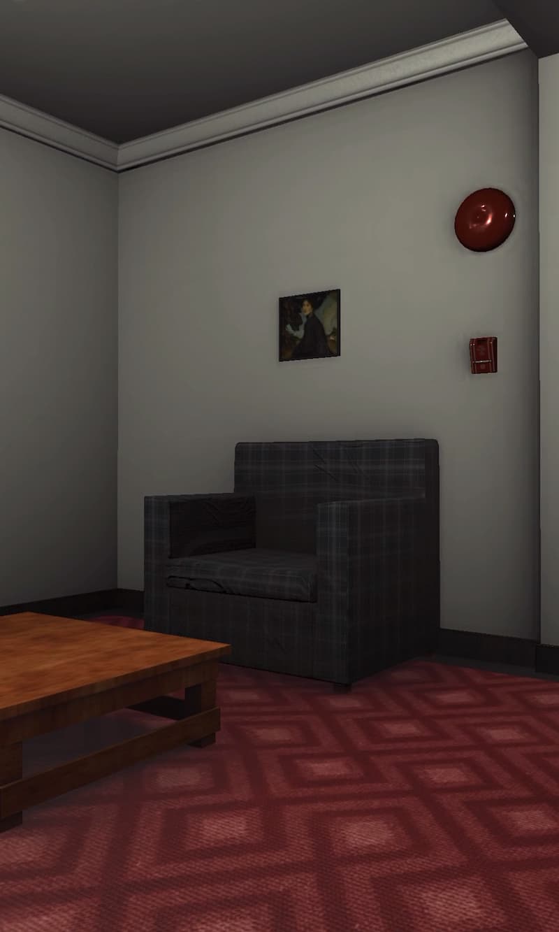
We took a great deal of care in optimizing models and textures to get the best performance on our mobile phone targets, while still achieving detail and believability on items like the elevator's carved wooden paneling, and the woven carpet floors.
We placed dynamic lights down the length of the hall to match the overhead fixtures, allowing us to turn them on one-by-one for dramatic effect at the beginning of the experience, as the hotel "awakens", but also allowing us to flicker or even turn lights off as part of our haunting effects.
Bringing it to Life
We had the ominous hotel in our hands, but for the experience to be complete, it needed to feel alive. More specifically, we wanted the entire environment to behave as if it were reacting to—and being driven by—the user's presence.
Ghostly Appearances
We included Grady, the former caretaker of the hotel, as well as his two infamous twin daughters ("Come and play with us"), as ghosts haunting the hotel.
Custom components were written tying their appearances to the user's position and where they are looking, allowing us to predictably orchestrate their actions without placing any restrictions on the behavior of our users.
For example, the girls only appear if users are between between ten to thirty feet away, and only appear when users aren't looking in their direction. This sleight-of-hand ensures they never "pop" into existence, but always surprise you—just standing there, in a spot you swore had been empty a moment ago.
We wanted the environment to behave as if it were reacting to the user's presence.
Only then, when the user is looking directly at them, do the girls invite you to play, before disappearing as the lights suddenly flicker.
Other apparitions appear suddenly and directly in front of users, their jarring appearance heralded by the sudden loss of lights. Randomized lighting effects and unexpected musical stings keep the mood unsettling.
The ghost of Grady waits at both ends of the hall, and like the other apparitions, his interaction with the user's location and sightlines results in emergent behavior that ensures every encounter and experience is unique.
User Movement
Kubrick's long trailing shots following young Danny's tricycle are a cinematic touchstone. We made a nod to this in placing the user's perceived camera height lower than we typically would, subtly evoking a child's-eye-view of the hallway.
We also developed a uniquely simple dynamic for user movement through the hallway. We didn't want to clutter the screen with joysticks or buttons—instead, we implemented a single-touch movement interface.
Users can turn and look in any direction either by physically turning their phone or swiping/dragging a finger across the surface, and they move forward in whichever direction they are looking any time they're touching the surface of their phone. It's a simple and remarkably intuitive interface that we were very pleased with.
Hallway Hotspots
The physicality of the 3D hallway allowed us and the team at Warner Bros. to craft a hierarchy of content throughout the space, with opportunities for high-touch/traffic points along with deeper and more rewarding content placed a little further away, like easter eggs awarded to the adventurous.
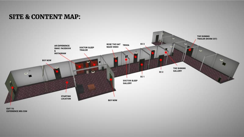
We placed corresponding floating markers at each position, using a custom shader to make them look unearthly and wraithlike.
Galleries, Videos, Quiz
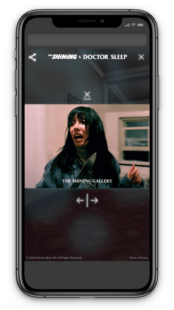
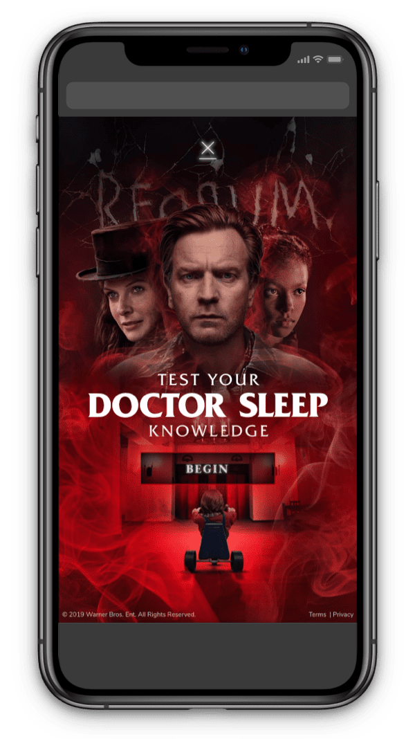
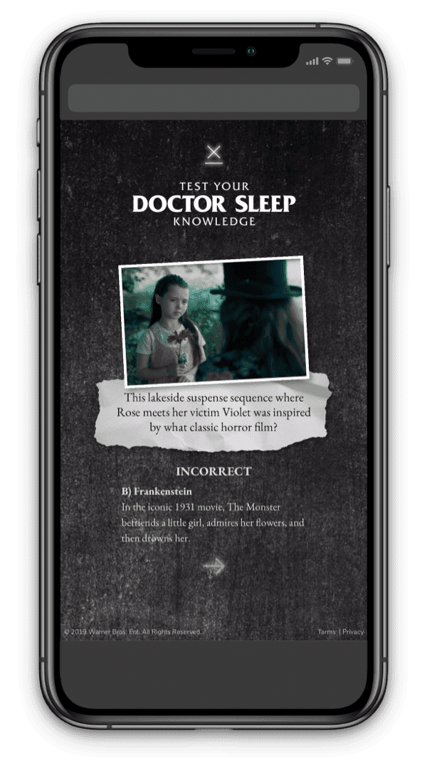
Using the 3D map to guide our content placements, we supported both films with galleries, trailers, and bonus documentary content, as well as a quiz covering interesting plot points from Doctor Sleep to help initiate viewers to the new film. After completing the quiz, fans could share the results to the social network of their choice.
AR Effect
To capture further interest on social media, we also gave a coveted content spot at the blood-red elevators to a new augmented reality effect our team developed for use across Snap, Facebook, and Instagram.
To capture further interest on social media, we also gave a coveted content spot at the blood-red elevators to a new augmented reality effect our team developed for use across Snap, Facebook, and Instagram.
Users could launch the effect on the platform of their choosing, becoming a member of Doctor Sleep's "The True Knot"—spirit vampires who inhale the life force of children with the shine.
You can try out the archived experience here.